

Threshold Carve: Marketing Agency
Art Direction | Strategy | Proposal Booklet | Logo Identity | Trailer Wrap | Vehicle Wrap
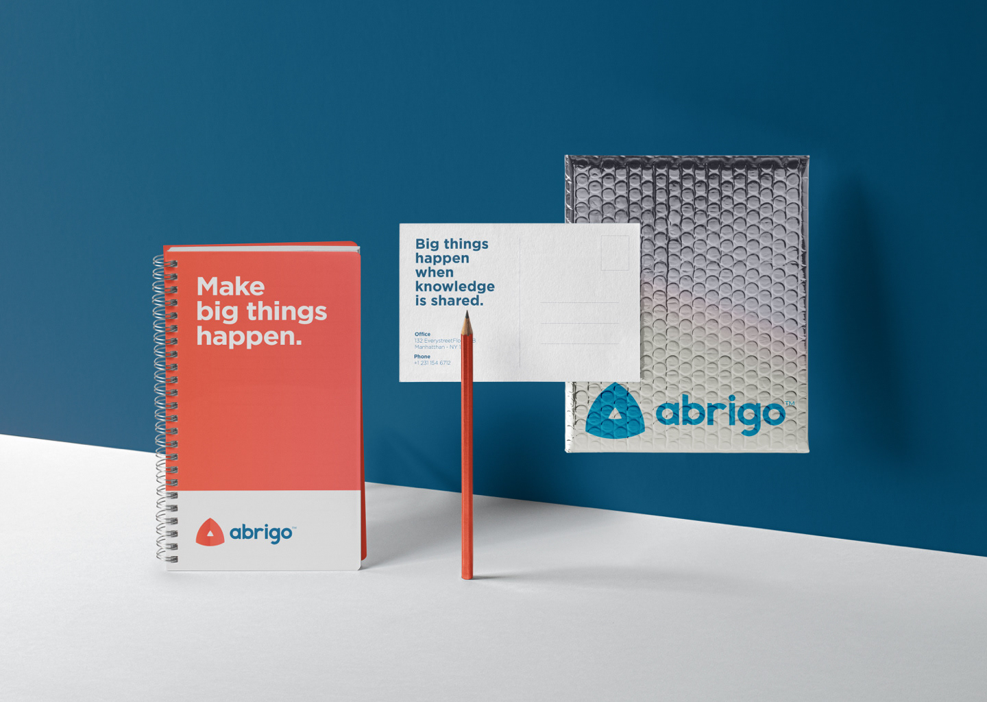
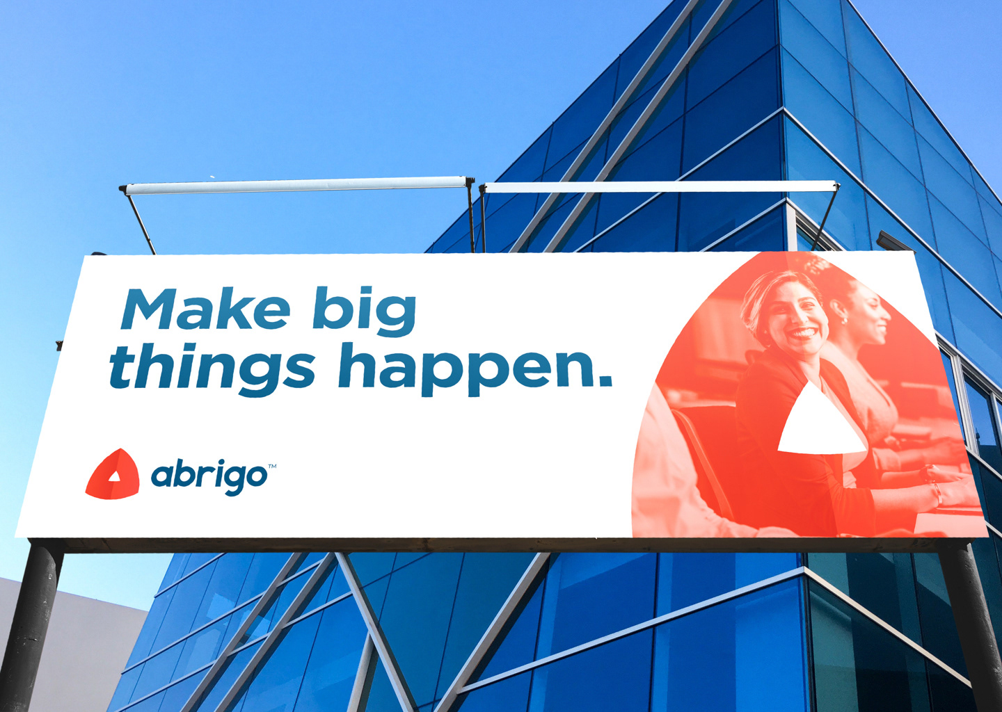
Abrigo Logo Branding
Three financial tech companies were integrating to become one company, Abrigo. This new unified process led to request of creating a unique visual representation of a new Abrigo brand to be distinct in the fintech space and reinforce the Abrigo brand personality.
The Idea: In Portuguese, Abrigo means shelter or cover. Protection and security can come in many forms. Turning a shield upside down represents defense, Three point represent a three companies completing a system, the window resembles a shelter or home, and the shape resembles the letter A for Abrigo.
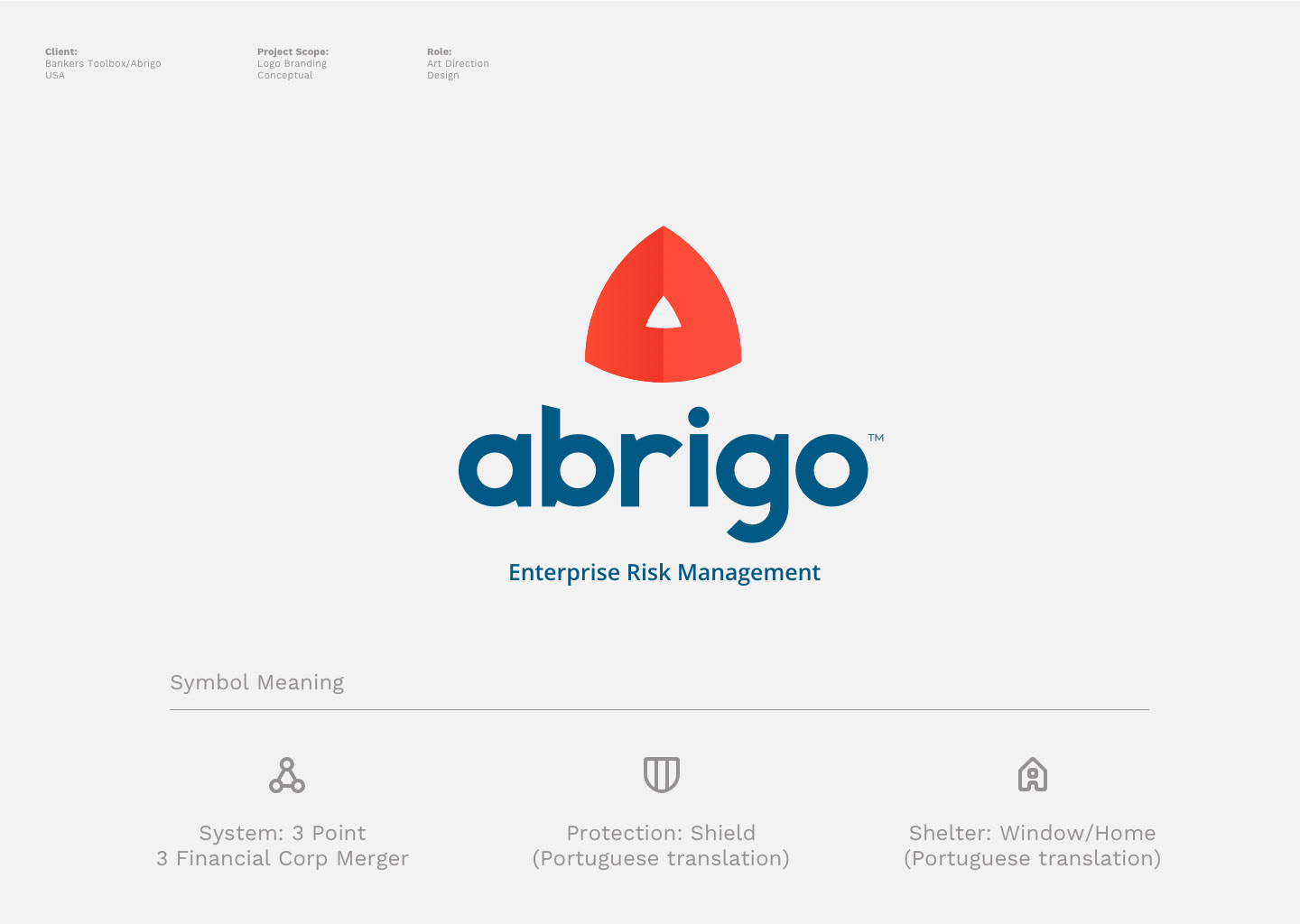
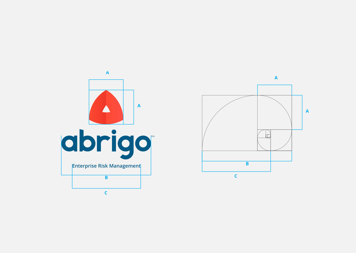
The symbol grid is based on the Golden Ratio rules that make the image perfectly balanced, yet dynamic.
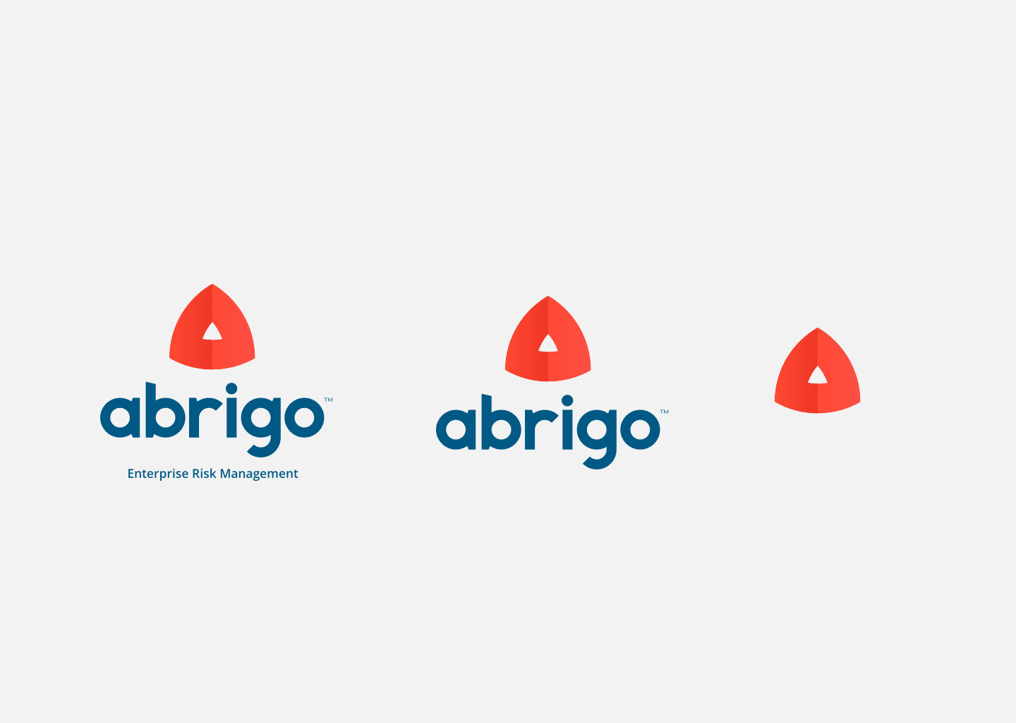
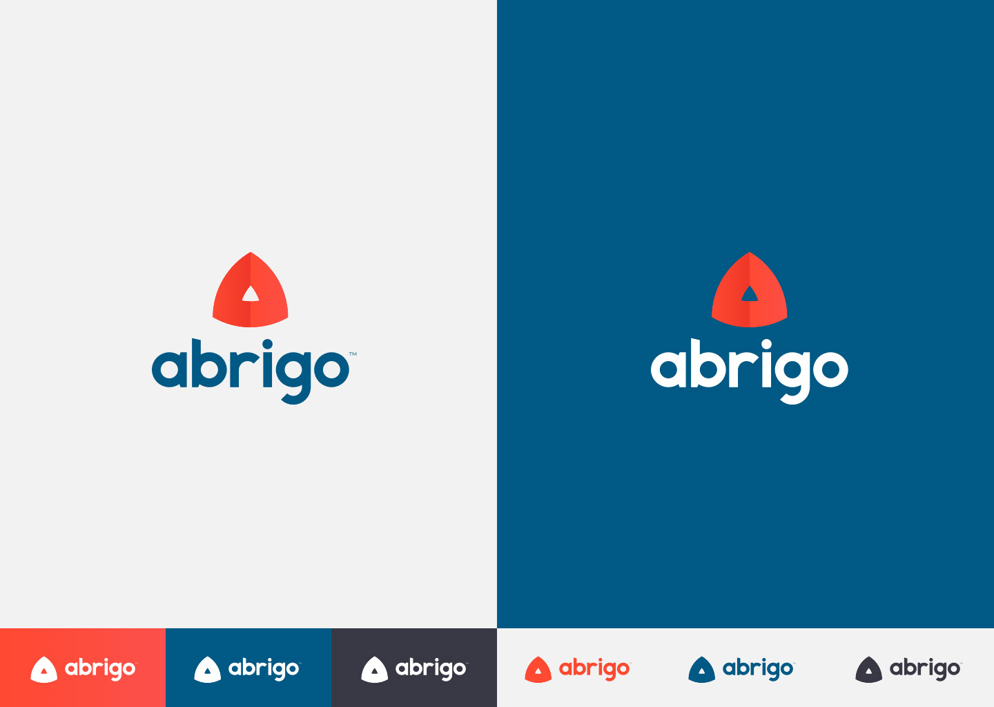
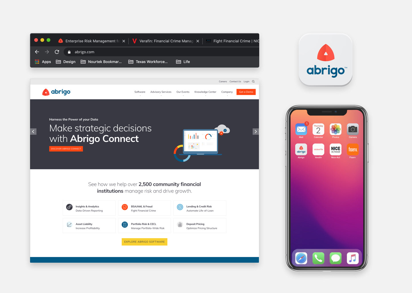
Responsive Logo: The option to have multiple lockups was important for uses where the identity would be smaller on digital applications such as favicon, websites, apps, and alert notifications.


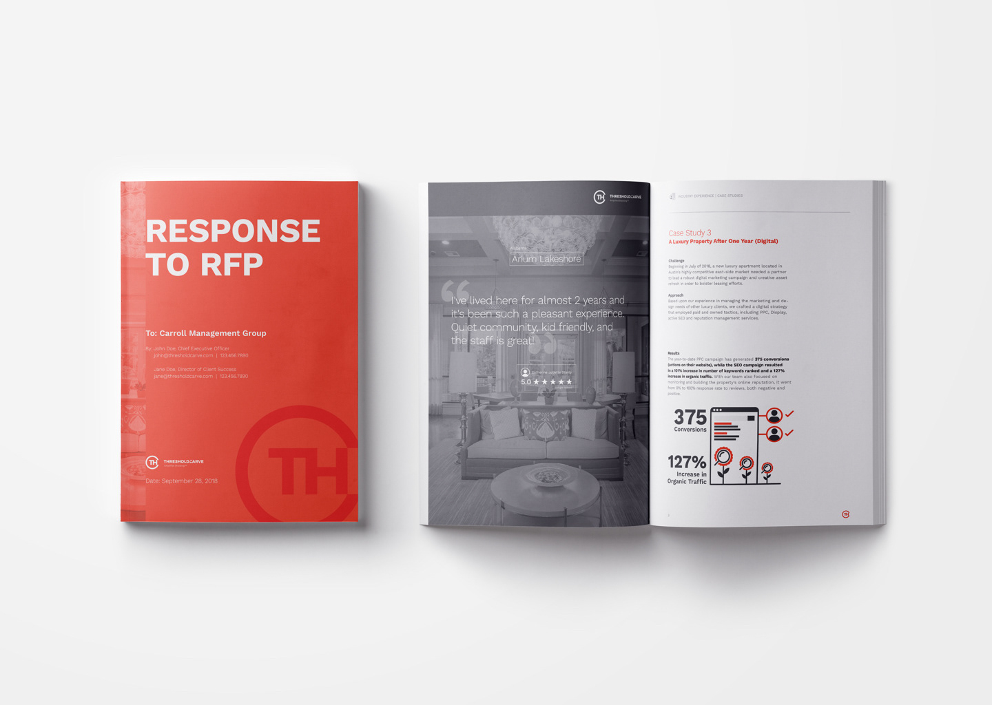
Client Proposals
Connecting with potential new clients is much easier than landing a contract. It's important that client touch point is high quality and well thought out. Not only with presentation but with key metrics that speaks to that potential market and a deep dive of research so the client understands we know who they are and who their customers are.
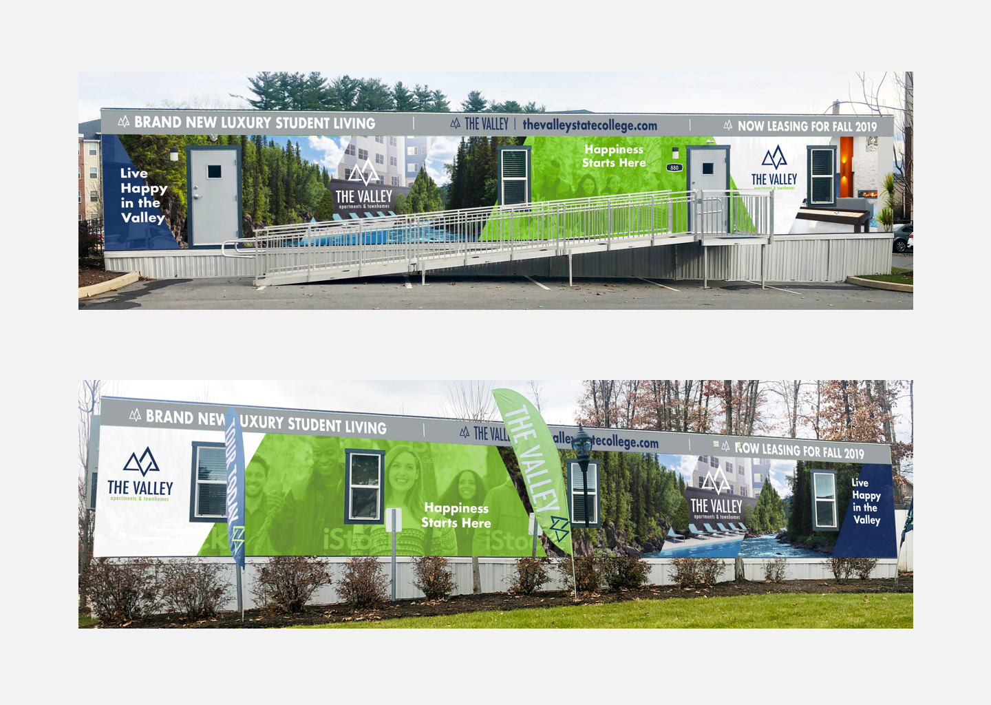
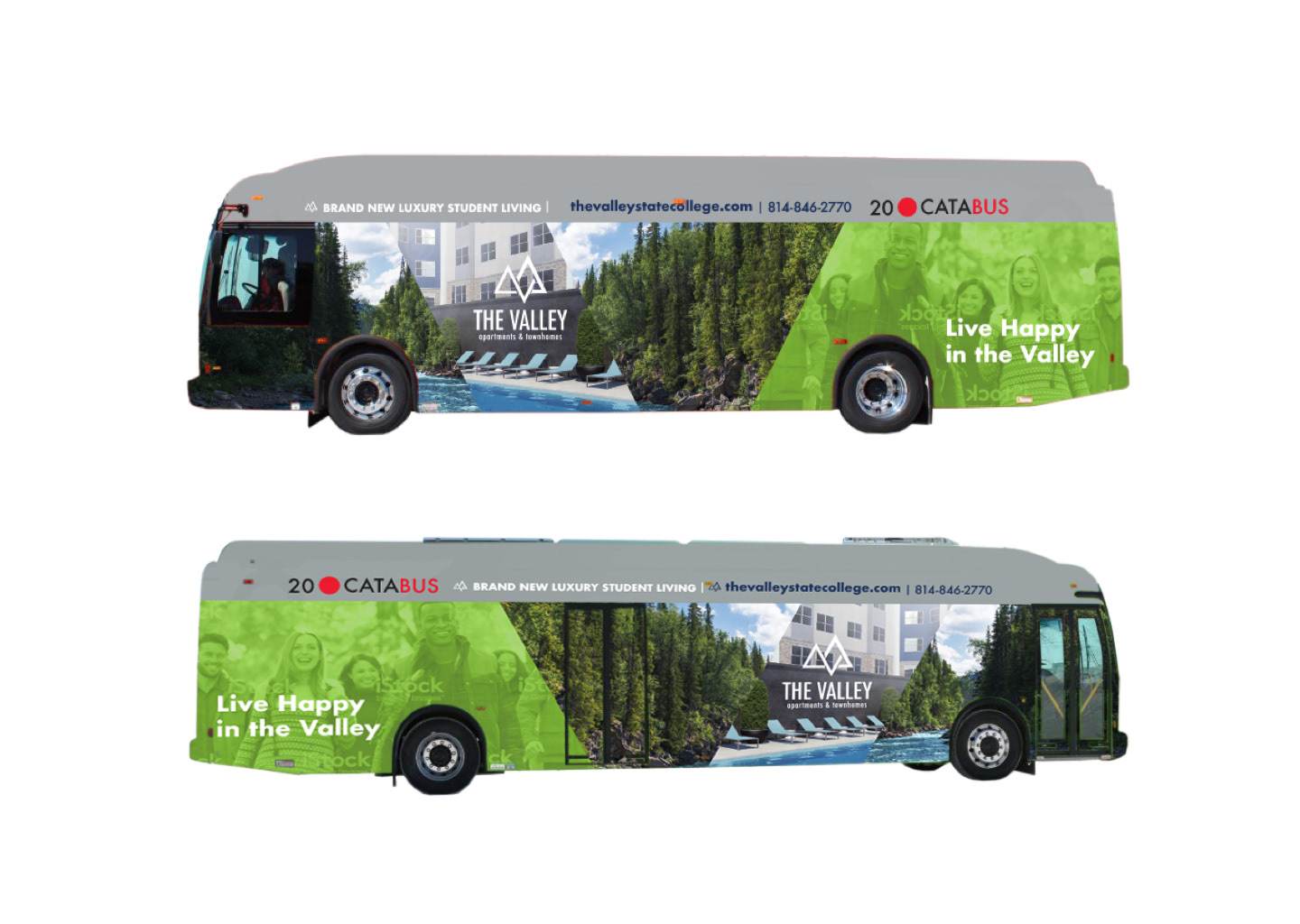
The Valley Exterior Wraps
Asset Campus Housing was almost complete with its its new campus apartment complex, The Valley. As many marketing pieces were put into place, Hyping the new housing and literally driving potential students to get early access to virtual scenic rooms and layouts at one of the pop-up leasing trailers.